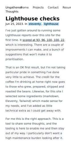
I've just gotten around to running some Lighthouse reports over this site for the first time. It scored at 93, 96, 100, 100, 22, which is interesting. There are a couple of improvements I can make, and a bunch of suggestions that won't make it to prioritisation.
That is an OK first result, but I'm not taking particular pride in something I've done very little to achieve. The credit for the coffee I'm drinking at home right now goes to those who grew, prepared, shipped and roasted the beans. Likewise, for this site I selected some ingredients (markdown, Eleventy, Tailwind) which made sense for my needs, and I've added as little technical extra as I could get away with.
For me this is the right approach. This is a tool to share some thoughts, and the tooling is here to enable me and then stay out of my way. I particularly don't want a high maintenance burden looking after it. So if anything, in that 93 score I can take a little credit for picking tooling that's delivered decent results out of the box.
The 22 is the PWA ranking in Lighthouse, and something which highlights criteria which make sense for a limited range of sites. It's a useful reminder that Lighthouse metrics definitely aren't to be pursued just to get "all green" ratings. Few of those checks are for things which would add meaningful value to this site.
On the other hand, there are a couple of improvements identified in the first test which I could knock off pretty easily, and did so.
- Seeing that loading the PrismJS libraries from a CDN was the biggest single wait time nudged me to finally fix code formatting here. Until now I'd shrugged and used Github Gist embeds - also fine. Fixed.
- One of the accessibility checks flagged that I had not correctly set the language metadata in the root HTML tag. Fixed.
Result: 95, 100, 100, 100, 22, and more importantly two minor annoyances fixed. For this content page now, a slightly higher rating - 99, 100, 100, 100, 22.
Thanks Lighthouse, that was helpful after all!
And not from the numbers but the screenshot, a nudge for me to sort out the site title and menu which overlap at present. Not fixed yet.
