A conversation this evening reminded me that there are a few great fonts around that really assist legibility, that I appreciate having discovered these tools, and that others might appreciate them being shared on!
Here are a few fonts I appreciate for a legibility boost. These are not the fonts I've used on this site (see Newcombe 35 for that). I often use the first font below, Atkinson Hyperlegible, as the font for reading in my web browser.
Atkinson Hyperlegible
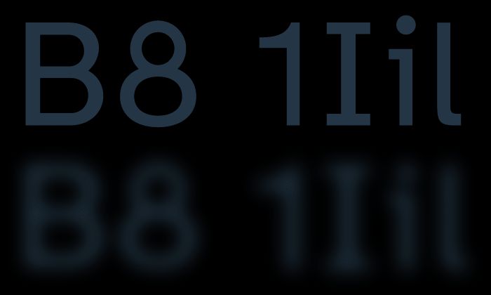
This is my preferred font for reading. The font focuses on letterform distinction to increase character recognition, ultimately improving readability. It aims
Where letters might otherwise be confusingly similar - especially in a reduced or low vision context - Atkinson Hyperlegible uses design techniques to ensure letter forms are more clearly distinguished.

B612 by Airbus
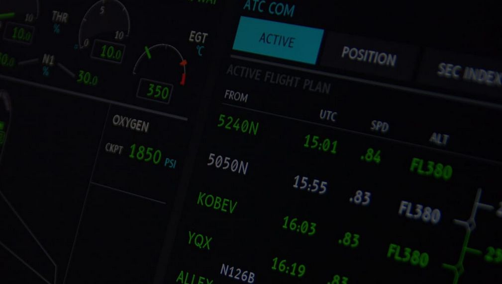
Aircraft cockpits and displays demand minimal chance of confusion, for which Airbus created B612, a highly legible open source font family designed and tested to be used on aircraft cockpit screens. Airbus worked with Intactile Design to produce an "Aeronautical font", to improve the display of information on the cockpit screens, in particular in terms of legibility and comfort of reading, and to optimize the overall homogeneity of the cockpit.

OpenDyslexic
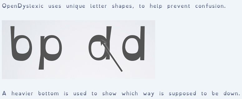
I'll be honest: this one doesn't work for me. It does work for some, so I'm including it here. OpenDyslexic is created to help with some of the symptoms of dyslexia.
I see the design features which support those reading with Dyslexia. While I appreciate what it's doing, I find it too much for me, and that the font is less legible - and that's fine, since I guess it's not designed for my needs. I'm glad it exists and works for some folks.
